5 Ways to Improve Your Restaurant’s Curb Appeal
How many times has an intriguing window display at the mall or in your nicest shopping district caught your attention? Probably every time you visit.
The outside of your restaurant is your window display. It’s a huge opportunity that you control and, when done well, can be a powerful magnet to draw in new customers and remind regulars that visiting is a worthy experience.
The curb appeal of any business is often the first impression that people have when driving or walking by. In a sense, your exterior serves as a 24/7 surrogate billboard that conveys many messages. And that’s where the process of enhancing your message should begin: What do you want people to think, feel, and expect when they see your establishment from the outside?
For example, a list of messages could include:
- Offers Mexican food
- Projects a hip, casual image
- Shows a high-energy place
- Parking is easy and safe
- Offers takeout
- Promotes quality and cleanliness
There is no universal list. Your goals will depend on your concept and market. After you are clear on what you’re trying to achieve, it’s time to take inventory on all of the areas that can turn this wish list into a critical part of your marketing machine and restaurant brand builder.
5 Ways to Create More Impact
Here are five common areas and some simple ideas that can make the greatest impact:
1. Signage
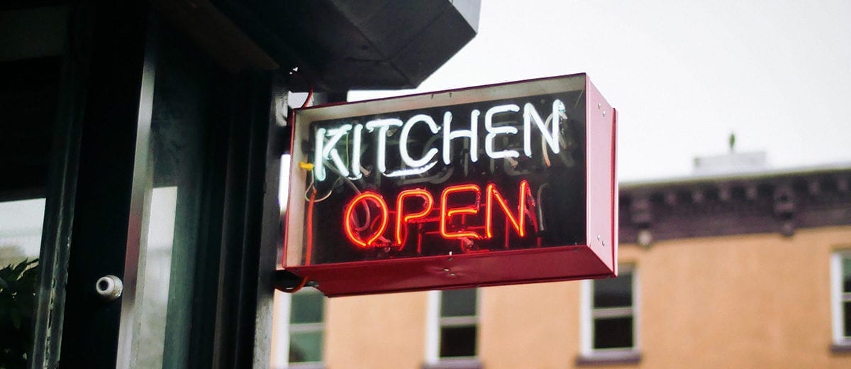
Make sure outdoor signage is visible and readable day and night. This can include adjusting small things like the lighting and clearing away objects that block the view of signs or other elements. Choose graphics and text that best reflect your concept. Monitor that everything is working properly. When lights are burned out on a sign for The Prickly Pear, just the word “Prick” may not be the desired image. And remember, quantity is not always the answer. Too many competing signs can send the message of cheap and desperate. Strive for the most effective communication. Finally, evaluate what your neighbors are doing — you want to stand out and not blend in.
2. “Restaurantscaping”
Alright, this is a made up word. It means how you finish your restaurant building’s structure. For some it can mean adding foliage and trees, while for others it could be using materials like rock or some other interesting fillers. Whatever you do, it should be maintained and consistent with your concept and brand. Big scale art, painting a mural on one of your walls, or incorporating unique architectural elements can all have a memorable impact. Do consider the color, texture, and contrast of your elements and what you are competing with — your neighbors. You want to earn the most attention and project your brand image.
3. Parking Area
Your parking is often the first part of your customer’s experience journey. Make it the best it can be. You should always have clean, clearly marked places where customer parking is allowed or not allowed. Nothing is worse than no signage or bad signage. A perfect way to ruin a positive restaurant experience is to have guests leave only to discover that their cars have been towed. If you offer valet, consider the drivers’ uniforms and key station. Both should be on-brand. If you provide takeout, close marked parking is a plus. Adding other elements like music speakers and a venting system that pumps out a savory scent can add a nice sensory dimension, too.
4. Lighting
Lighting is critical for achieving optimal curb appeal. It not only addresses safety, but also sets the tone for the atmosphere and brand experience. Simple lighting treatments can include wrapping trees and poles with tiny lightbulbs, adding fire torches, or putting spotlights on interesting design elements. You can also use colored lights for luminary effects.
5. Outdoor Waiting and Dining Areas
These areas are important because they not only serve a function, but also send a message to people walking or driving by your place. These outdoor spots can be highlighted by adding interesting furniture, waiting benches, fire pits, colored umbrellas and tables, tarps and awnings, and, of course, with proper lighting.
No matter what you decide, don’t underestimate the power of small details. This can be anything from how you display your street address numbers, to how you provide a menu outside, to how you control vendor advertising. Vendor promotions like beer and liquor banners can work with some concepts, but with others it can downgrade an image. Carefully consider your choices. And finally, make sure you are mindful of any ugly eyesores like trash and trash receptacles, A/C units, and any unattractive electrical wires. Hide or camouflage these things.
Your curb appeal counts. When it comes to curb appeal, you control the impression that your restaurant makes. Make it the best and as on-brand as it can be.


